Our strengths:
The foundation of our brand
For many decades, BKK ZF Partner has stood for trust, reliability and regional proximity. Our brand is firmly anchored - not as a trendy shell, but as a genuine partner in all phases of life.
Our strong customer loyalty shows: People stay with us because they know what they have in us. Because they know us, rely on our services and feel they are in good hands.
Our identity was and is clear: we are the health insurer with a face. Personal. Close. Authentic. Our roots - from Friedrichshafen to Brandenburg - are an expression of our local responsibility.
These strengths will be retained. They form the basis for our new image - modern, clear and digital.
Our challenges: Why we are evolving
As reliable as our services are, our brand communication has recently had a few construction sites. Our previous image was often heavily influenced by our annually changing advertising campaigns. Colors and elements were used differently depending on the campaign - a consistent
recognition value was increasingly lacking.
Our materials and media also often seemed overloaded.
Lots of information, little room to breathe - that didn't always make it easy for our members to find their way around quickly. What's more, our brand was barely visible outside of advertisements and flyers. Letters, digital applications and everyday service often lacked a connection to the brand world.
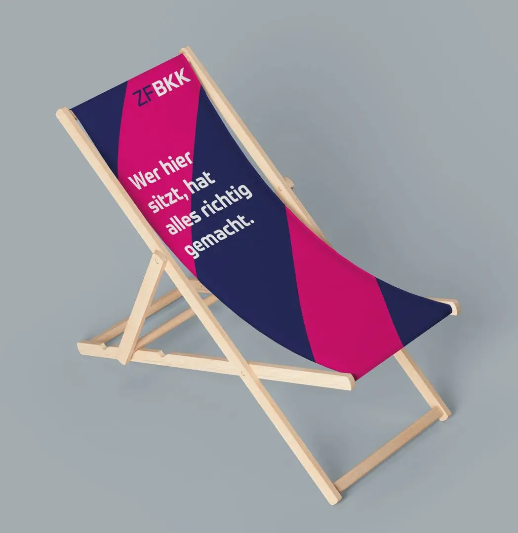
Colors that suit us
An appearance that feels real
With the new brand identity, we have made a conscious decision to take a bold step:
A world of color that clearly stands out from the familiar while showing attitude. The aim was to create a visual identity that not only catches the eye, but also stands for what defines us:
Movement, orientation, support and clarity.
The decision for this new color scheme was based on a systematic exclusion of competition.
This means that we analyzed which colors are already widely used in the statutory health insurance market - and deliberately chose alternatives that have hardly been used so far, if at all. This resulted in a color concept that creates freedom in design, enables differentiation and underlines our uniqueness.
Our new world of color is more than just design - it is an expression of our attitude. It unites modernity with warmth, combines digitality with approachability and supports our navigation through a complex healthcare world. At the same time, it remains clear, calm and recognizable at all times - whether in the magazine, on the website or in the app.
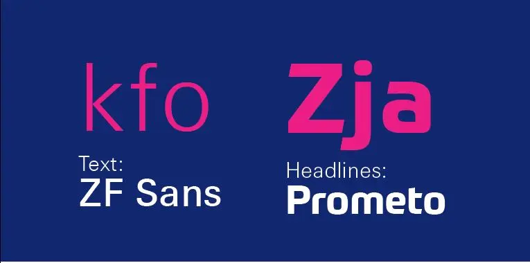
New typeface, clear course
With our new brand identity, we have deliberately opted for a new typography - clear, strong in character and digitally optimized. Our new typeface conveys exactly what is important to us: accessibility, modernity and personality.
It looks open, reader-friendly and harmonious - on paper as well as on the screen. Its subtle curves, balanced character spacing and clear structure create confidence and facilitate orientation. At the same time, it remains factual enough to radiate seriousness even in official contexts - but with a friendly tone that creates closeness. The new typography supports our stance as a reliable, human and future-oriented healthcare companion.
It is not a design gimmick, but a central part of our identity. Because: type directs the eye, guides through content and shows what we stand for - every day, on every medium.
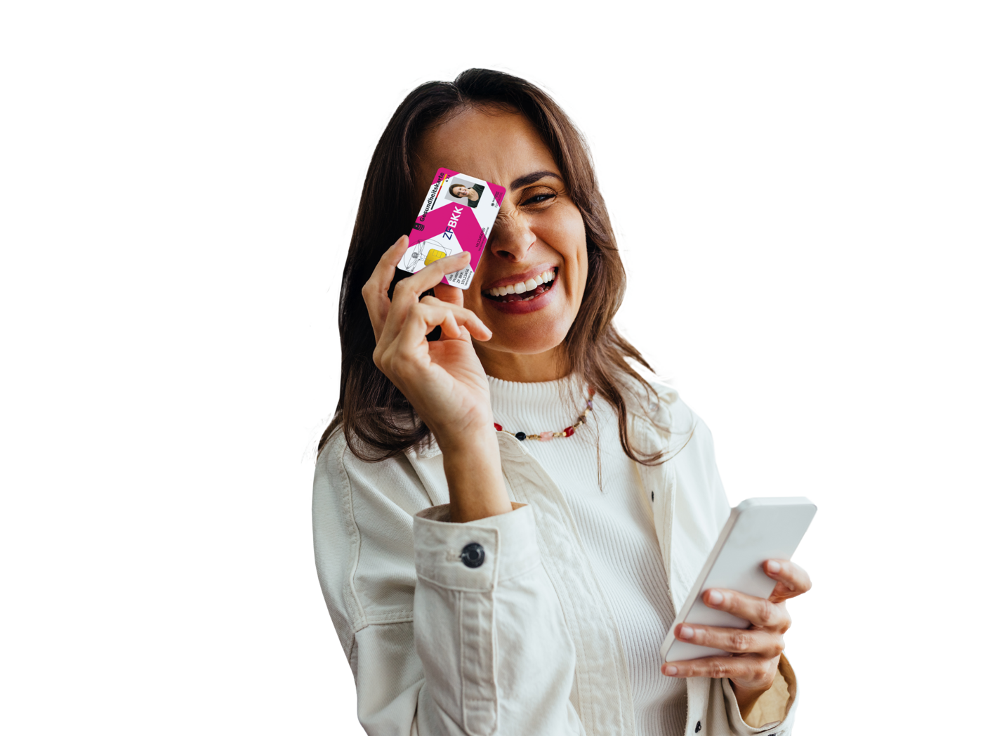
Fresh images, clear message
Our new imagery is a central component of our brand identity. It translates our values into strong images - clear, emotional and to the point. In doing so, it follows a clear creative line, not a coincidence. Clarity through staging Even complex topics become visible - with our themed imagery. It brings content into focus with bold colors, clear backgrounds and targeted perspectives. Whether health apps, services or benefits - every image gets to the heart of the message.

Signal effect with a system
A special highlight is our secondary design element - inspired by the world of road signage. Arrows and signposts are symbolic of our attitude: we provide orientation, offer safety and guide people along the right path.
Used in our primary colors, these graphic elements provide structure, dynamism and recognizability - in any medium
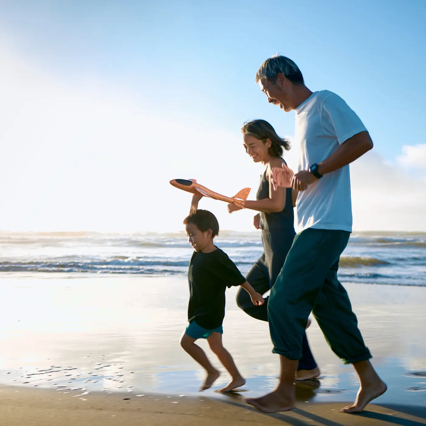
Authentic. Close. Close to life.
The focus is on real people - our policyholders. The photos show them in everyday moments, approachable and natural. Instead of staged scenes, we focus on authentic situations and friendly, warm lighting moods.
The eye-level perspective turns viewers into participants. This creates an atmosphere of trust - and a visual style that stands out.

Illustrations that show movement
Our visual language is complemented by a modern illustration style. Geometric, minimalist and consistently in our brand colors, the drawings convey technical clarity and emotional lightness at the same time. They make health topics accessible - and show: We bring movement to your health.
The result is a visual world that is more than just beautiful. It is functional, independent - and gets to the heart of our attitude: We are here. Visually. Clear. And always on the move.
What has not changed
Nothing has changed in our services since the beginning of the year - and that is exactly the good news. Because what has proven itself remains the same.
Our TOP services will accompany you reliably through all situations in life. They not only make health more affordable, but also simpler, more digital and more personal. Whether bonus programs, digital services or strong subsidies - with us you are on the safe track.
Here are a few highlights that show what our policyholders value:
Professional teeth cleaning
We cover €30 twice a year if the treatment is carried out by a dentist with health insurance approval.
Individual advice
In our branches - personal and close
Online office & ZF BKK Service App
Say goodbye to paperwork: With our digital platform, you can take care of your concerns quickly and easily.
Our reminder service
Regular notifications remind you of important check-ups for children and adults.
All services. At any time. Online.
Our website offers you access to comprehensive health information at any time.
What do you think of our new look?
New design, clear language, fresh colors - our brand identity has changed.
Now we would like to know: What effect does this have on you? Whether spontaneous, detailed or simply a short feedback - every feedback helps us to respond even better to your expectations. After all, our communication should not only be appealing, it should also be well received.
Write to us directly at: marketing@zfbkk.de